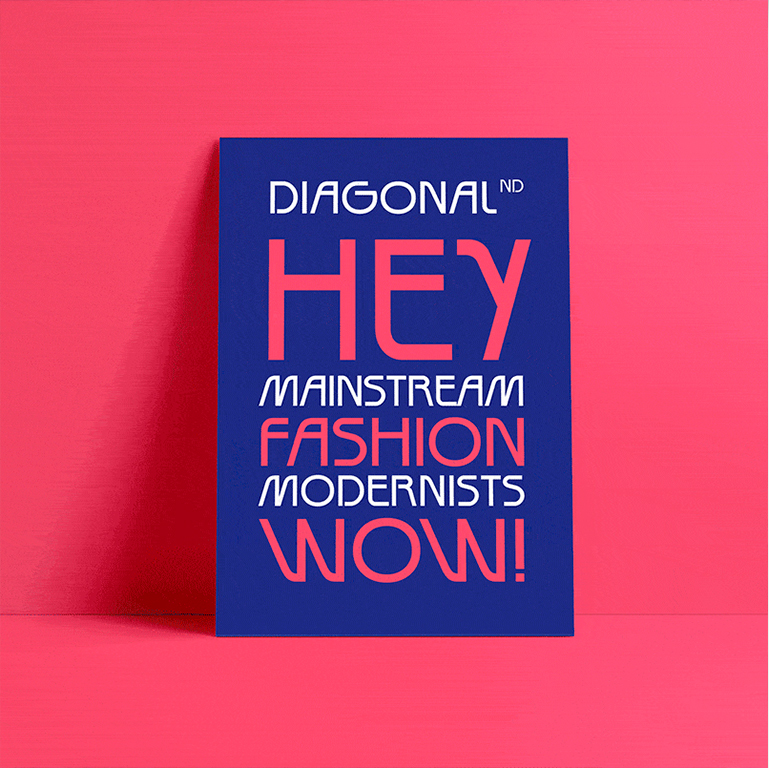
DIAGONAL ND
Inspired by Barcelona’s Diagonal street, Antoni Morillas designed Diagonal ND in 1970. A sans that alternates straight and inclined lines, with a strong rhythm and its own personality. Its range of possible usages are very varied: signage, headlines, packaging, etc.
Diagonal is a Trademark of BauerTypes SL


1 INDIVIDUAL STYLE
Available for DESKTOP | WEB | APP | ePub | SERVER | OEM licences
LICENSES
DESKTOP
The Desktop license allows you to install the fonts on the number of computers (CPU’s) for which the license has been purchased and use them in the programs installed on the computer. It allows you to create documents, static images, presentations or layouts for printing or publishing.
WEB
The web license allows you to use the fonts in web environments, in the purchased domains and for a period of time that will be renewed at the end of the contract. The range of use depends on the number of web users, number of visits, server or domains, among other variables.
OEM license
An individual OEM product license with licensing contract (stipulated by NDA [non-disclosure agreement]). This license is required for products in which the typographic software (fonts or parts of the fonts) is combined with hardware or software created or programmed by the OEM, such that it appears as its own product.
APP
The mobile apps license permits integration of fonts on the iOS, Android, and Windows RT platforms. Each license is specific to a single platform and is valid for the application’s entire lifespan. Acquiring new licenses is not necessary for free updates, If the font is not integrated directly in the app, for example if it is used to create a static image, you will need a desktop font license.
ePub
The electronic publications license permits integrating a font into electronic documents such as e-books or electronic magazines or newspapers. Each license is valid for a single title, for the duration of its functional lifespan. If the font is not integrated directly into the electronic publication, for example if it is used to create a static image such as the cover of an e-book, you will need a desktop font license.
SERVERs
The server license permits installation of fonts on servers accessible to remote users and webpage visitors. Users must not download typographical data or use it outside of the server. The font should not be used on a SAAS (software as a service) application, where the service is in fact the product, rather than the medium used. A server license covers a specific number of production servers on which the font is installed.
third parties
This license allows you to share the typography with co-agents, advertising or branding agencies, developers or other external collaborators. This will be a desktop license and the range will depend on the number of computers required.
COMmERCIAL
Although it may seem confusing, a commercial license is nothing more than a distribution license for products that, in their design, the licensed typography provides a differential value. Products such as clothing, merchandising or packaging, are considered to need a separate license because of the differential value that the typography can provide
digital marketing
This license allows you to publish marketing actions at a digital level, including ads on social networks, automated campaigns and other advertising elements. The rank depends on the number of impacts of the campaign. The own social media publications use a separate license.

ABOUT
Sans serif typeface created in 1970 inspired by the Diagonal street in Barcelona, with small caps, punctuation and numbers. The alternation of straight and slanted lines gives the alphabet a strong rhythm and its own personality. It has a range of application possibilities for example in the packaging sector, but also in magazine headlines and posters.
Antoni Morillas (1932-1983) began as a graphic designer in Seix Barral in 1955. He is a founding partner of the ADG / FAD and member of the AGI (Alliance Graphique Internationale). In 1962 he started with his own studio, from which he produced important graphic creations which has been shown in exhibitions such as ‘Intergraphis’ (Montreal), ‘Wanderer’ (Los Angeles), at the University of Honolulu or the Museum of Berlin.
